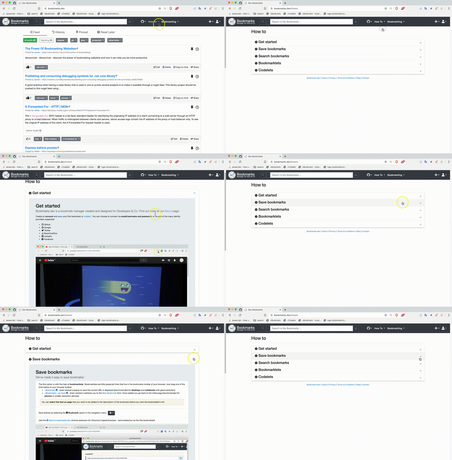
Angular material expansion panel and accordion example
I find accordions pretty well suited for FAQs or HowTo pages. That’s why I chose one for the HowTo page of www.codever.dev, which is implemented with angular material expansion panel and accordion.

This blog post presents the source code for that with a couple of notes.
 Source code for Codever.dev is available on Github -
Star
The source code
  <mat-accordion>
    <mat-expansion-panel>
      <mat-expansion-panel-header>
        <h4><i class="fas fa-xs fa-info-circle"></i> Get started</h4>
      </mat-expansion-panel-heade}r>

      <ng-template matExpansionPanelContent>
        <app-howto-get-started></app-howto-get-started>
      </ng-template>
    </mat-expansion-panel>

    <mat-expansion-panel>
      <mat-expansion-panel-header>
        <h4><i class="fas fa-xs fa-info-circle"></i> Save bookmarks</h4>
      </mat-expansion-panel-header>
      <ng-template matExpansionPanelContent>
        <app-howto-save></app-howto-save>
      </ng-template>
    </mat-expansion-panel>

    <mat-expansion-panel>
      <mat-expansion-panel-header>
        <h4><i class="fas fa-xs fa-info-circle"></i> Search bookmarks</h4>
      </mat-expansion-panel-header>
      <ng-template matExpansionPanelContent>
        <app-howto-search></app-howto-search>
      </ng-template>
    </mat-expansion-panel>

    <mat-expansion-panel>
      <mat-expansion-panel-header>
        <h4><i class="fas fa-xs fa-info-circle"></i> Bookmarklets</h4>
      </mat-expansion-panel-header>
      <ng-template matExpansionPanelContent>
        <app-howto-bookmarklets></app-howto-bookmarklets>
      </ng-template>
    </mat-expansion-panel>

    <mat-expansion-panel>
      <mat-expansion-panel-header>
        <h4><i class="fas fa-xs fa-info-circle"></i> Codelets</h4>
      </mat-expansion-panel-header>
      <ng-template matExpansionPanelContent>
        <app-howto-codelets></app-howto-codelets>
      </ng-template>
    </mat-expansion-panel>
  </mat-accordion>
Notes
- the
mat-expansion-panelcomponents are encapsulated in anmat-accordionelement - the code itself for the several sections is encapsulated in own component, for better code readability and to access them directly
- the construct
ng-templatewith thematExpansionPanelContentattribute in the is used to defer initialization until the panel is open. By default, the expansion panel content will be initialized even when the panel is closed - by setting the input
multi="true"(defaultfalse) onmat-accordionyou could allow the expansions state to be set independently of each other
If you liked this, please show some love and give us a star Star

