Going mobile with Spring mobile and responsive web design
(P) Codever is an open source bookmarks and snippets manager for developers & co. See our How To guides to help you get started. Public bookmarks repos on Github ⭐🙏
Contents
As mentioned in Story of Podcastpedia, the next thing that needed urgent improvement on Podcastpedia.org, was to make the website more user friendly for mobile users. This post will present how, with the help of Spring Mobile, the website can detect now if the request is coming from a mobile device and act accordingly: it displays a mobile view employing some responsive design features, while also offering the possibility to choose the preferred way (desktop or mobile) for displaying the web pages.
1. Dependency
You need to add the spring-mobile-device-x.x.x.RELEASE.jar to your classpath. If you are using Maven like me just add the following dependency to your pom.xml file:
<dependency>
	<groupId>org.springframework.mobile</groupId>
	<artifactId>spring-mobile-device</artifactId>
	<version>${spring-mobile-device-version}</version>
</dependency>
2. Application Context configuration
Now you need to do a couple of configuration in your Spring application context. First introduce the DeviceWebArgumentResolver :
<mvc:annotation-driven>
	<mvc:argument-resolvers>
		<bean class="org.springframework.mobile.device.DeviceWebArgumentResolver" />
	</mvc:argument-resolvers>
</mvc:annotation-driven>
and secondly a DeviceResolverHandlerInterceptor and a SitePreferenceHandlerInterceptor:
<mvc:interceptors>
    <!-- Changes the locale when a 'lang' request parameter is sent; e.g. /?lang=de -->
    <bean class="org.springframework.web.servlet.i18n.LocaleChangeInterceptor">
        <property name="paramName" value="lang"/>
    </bean>

    <!-- Resolve the device which has generated the request -->
    <bean class="org.springframework.mobile.device.DeviceResolverHandlerInterceptor" />

    <!-- On pre-handle, manage the user's site preference (declare after DeviceResolverHandlerInterceptor) -->
    <bean class="org.springframework.mobile.device.site.SitePreferenceHandlerInterceptor" />
</mvc:interceptors>
2.1. DeviceResolverHandlerInterceptor
The DeviceResolverHandlerInterceptor is a HandlerInterceptor that, on preHandle, delegates to a DeviceResolver. The resolved Device is indexed under a request attribute named 'currentDevice', making it available to handlers throughout request processing. The default DeviceResolver implementation used for Podcastpedia.org is based on the “lite” detection algorithm implemented as part of the WordPress Mobile Pack. This resolver only detects the presence of a mobile or tablet device, and does not detect specific capabilities. No special configuration is required to enable this resolver.
2.2. SitePreferenceHandlerInterceptor
The SitePreferenceHandlerInterceptor enables SitePreference management before requests are processed. The indicated SitePreference is then used to vary control and view rendering logic, as shown in the getPodcastDetails method of the PodcastController:
@RequestMapping(value="{podcastId}/*", method=RequestMethod.GET)
public String getPodcastDetails(@PathVariable("podcastId") int podcastId,
                             ModelMap model,
                             HttpServletRequest httpRequest) throws BusinessException{

    LOG.debug("------ getPodcastDetails : Received request to show details for podcast id " + podcastId + " ------");

    Podcast  podcast = podcastService.getPodcastById(podcastId);

    //add the last episodes to be displayed under the podcast metadata
    List<Episode> lastEpisodes = null;
    if(podcast.getEpisodes().size() > 6){
        lastEpisodes = podcast.getEpisodes().subList(1, 6);
    } else {
        lastEpisodes = podcast.getEpisodes();
    }
    model.addAttribute("lastEpisodes", lastEpisodes);
    model.addAttribute("nr_divs_with_ratings", lastEpisodes.size());
    model.addAttribute("podcast", podcast);
    model.addAttribute("roundedRatingScore", Math.round(podcast.getRating() == null? 0 : podcast.getRating()));
    SitePreference currentSitePreference = SitePreferenceUtils.getCurrentSitePreference(httpRequest);
    if(currentSitePreference.isMobile()){
        return "m_podcastDetails";
    } else {
        return "podcastDetails";
    }
}
To obtain the reference to the current site preference, the SitePreferenceUtils (line 21) was used, by calling the getCurrentSitePreference method on the HttpServletRequest parameter. If the currentSitePreference is mobile a mobile view (m_podcastDetails) is selected, otherwise it will default to the normal (podcastDetails) desktop view. In Podcastpedia.org, you can choose your site preference by selecting the mobile or desktop icon at the top left corner, right after the social media follow buttons:
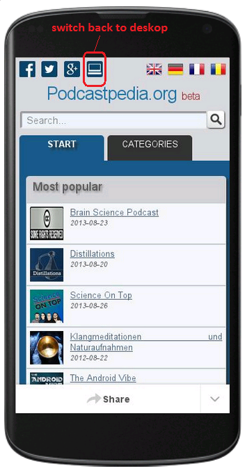
Mobile version – switch to desktop
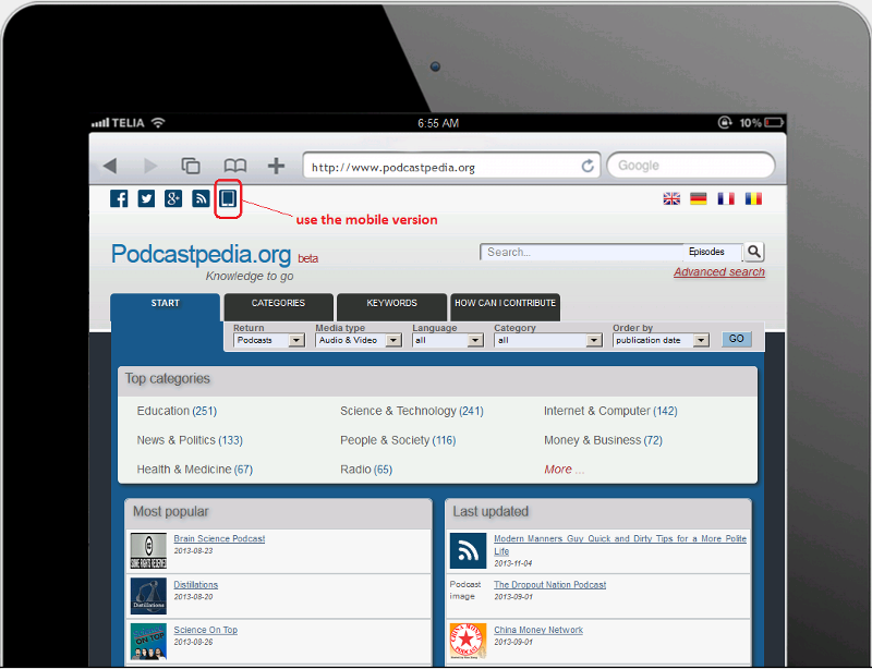
Desktop version – switch to mobile
Behind the image the currentSitePreference parameter is set to either mobile or normal:
<div id="logos">
    <a href="https://www.facebook.com/Podcastpedia" target="_blank">
        <img alt="Facebook" title="Follow us on Facebook" src="<c:url value="/static/images/logos/fb.png"/>">
    </a>
    <a href="https://twitter.com/podcastpedia" target="_blank">
        <img alt="Twitter" title="Follow us on Twitter" src="<c:url value="/static/images/logos/twitter.png"/>">
    </a>
    <a href="//plus.google.com/101757667729624824161" target="_blank">
        <img alt="Google+" title="Follow us on Google+" src="<c:url value="/static/images/logos/gplus.png"/>">
    </a>
    <a href="?site_preference=normal">
        <img alt="Desktop" title="Desktop" src="<c:url value="/static/images/logos/desktop_24.png"/>">
    </a>
</div>
The indicated site preference is then stored in a SitePreferenceRepository so it is remembered in future requests made by the user. CookieSitePreferenceRepository is the default implementation used and stores the user’s’ preference in a client-side cookie.
Note:
In addition, if no SitePreference has been explicitly indicated by the user, a default will be derived based on the user’s Device (MOBILE for mobile devices, and NORMAL otherwise).
3. CSS3 and responsive design
In the end I want to present some modifications I made to the original css file to allow responsive design capabilities. The main difference was to use media queries to shrink image sizes, modify widths, widths percentages, hide some elements:
@media screen and (max-width: 480px) {
....
}
@media screen and (max-width: 640px) {
    .col {
        margin: 1% 0 1% 0%;
    }
    .span_2_of_2 {
        width: 100%;
    }
    .span_1_of_2 {
        width: 100%;
    }
.....
}
On the home page, the Responsive Grid System was used to allow the podcast charts to slide under each other when the screen-width becomes small enough. Thank you very much Graham Miller for this:
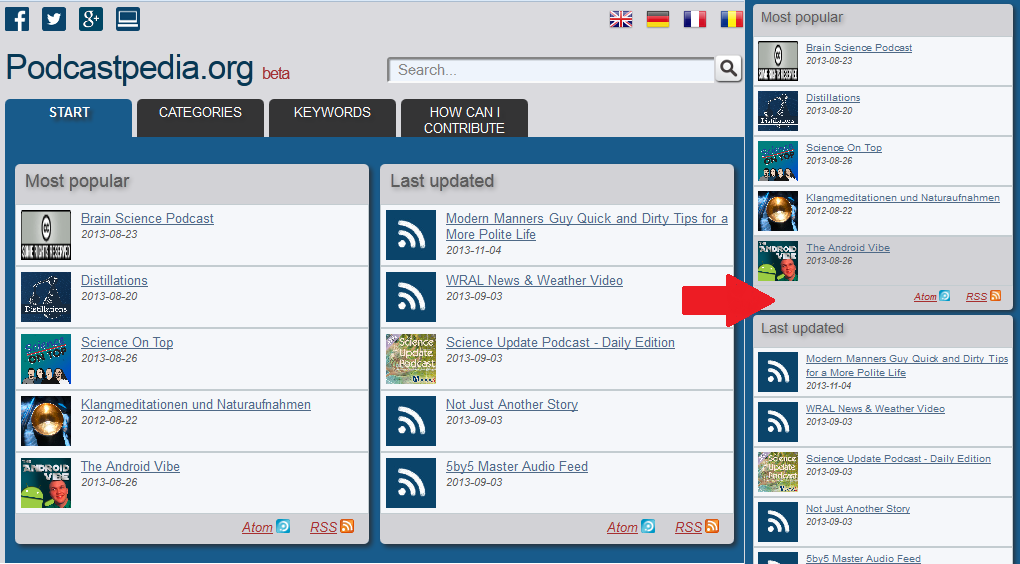
Podcastpedia.org’s home page responsiveness
You can download the complete css file here (media queries can be found right at the end of the file).
Apart from just modifying the css file, second .jsp files for mobile (e.g. podcastDetails<strong>_m</strong>.jsp) were added, in which some parts, present in the destkop version, were removed to speed up things on mobile. As mentioned in the post How To: Enable compression and leverage browser caching with Apache Server, using Google’s PageSpeed Insights to test how your web pages perform on mobile and desktop is highly recommended.
This is just the beginning of improving the mobile experience, so if you notice any room for improvement, PLEASE contact us or leave a message.
If you liked this, please show your support by helping us with Podcastpedia.org
We promise to only share high quality podcasts and episodes.