Simple trick to create a one line horizontal responsive menu with CSS only – Podcastpedia.org
(P) Codever is an open source bookmarks and snippets manager for developers & co. See our How To guides to help you get started. Public bookmarks repos on Github ⭐🙏
Contents
In this post I will present a trick I used to create the responsive menu on Podcastpedia.org :
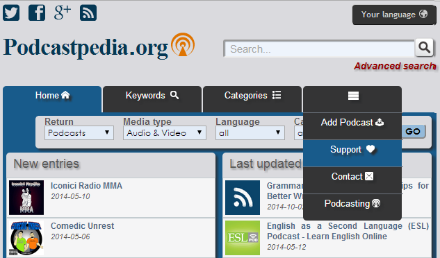
Responsive menu on Podcastpedia.org
 Source code for this post is available on Github - podcastpedia.org is an open source project.
There are lots of resources out there on how to design horizontal menus with sub-menus, so I won’t insist on that. My favorite so far is How To Create a Pure CSS Dropdown Menu[1] by @chrisspooner
1. The trick
Initially the items in the menu used to disappear if the size of screen got smaller, because of CSS overflow property that was set to hidden for the elements in list of the menu. I considered that a satisfying “responsive” solution for the beginning, but later it crossed my mind not to deprive the visitors with small screen resolutions from all the wonderful links you can access directly on Podcastpedia.org via the main menu…
1.2. Requirements
So a better solution was need and it had to satisfy the following requirements:
1.3. Result
You can see what came out in the initial picture or by visiting the Podcastpedia.org website. If by the time of your reading I will have already changed the design of the menu, you can have a look at this recorded video :
1.4. The magic
1.4.1. HTML/JSP Code
Well, the trick I used was to have the links from the menu inserted twice in the html code but with differend ids for the list elements containing them:
<div id="nav">
	<ul>
		<li id="nav-homepage">
			<a href="/">Home</a>
		</li>
		<li id="nav-tags">
			<a href="/tags/all/0">Keywords</a>
		</li>
		<li id="nav-categories">
			<a href="/categories">Categories</a>
		</li>
		<li id="nav-add-podcast">
			<a href="/how_can_i_help/add_podcast">Add Podcast</a>
		</li>
		<li id="nav-support">

			<a href="/how_can_i_help">Support</a>
		</li>
		<li id="nav-contact">
			<a href="/contact">Contact</a>
		</li>
		<li id="nav-podcasting">
			<a href="/podcasting">Podcasting</a>
		</li>
		<li id="nav-responsive">
			<a href="#"></a>
			<ul>
				<li id="nav-tags-resp">
					<a href="/tags/all/0">Keywords</a>
				</li>
				<li id="nav-categories-resp">
					<a href="/categories">Categories</a>
				</li>
				<li id="nav-add-podcast-resp">
					<a href="/how_can_i_help/add_podcast">Add Podcast</a>
				</li>
				<li id="nav-support-resp">

					<a href="/how_can_i_help">Support</a>
				</li>
				<li id="nav-contact-resp">
					<a href="/contact">Contact</a>
				</li>
				<li id="nav-podcasting-resp">
					<a href="/podcasting">Podcasting</a>
				</li>
			</ul>
		</li>
	</ul>
</div>
1.4.2. SCSS/CSS code
Now that the menu item are present twice, I can show and hide them based on the width of the display with media queries:
/** media queries to hide and show menu items, based on the display width */
@media screen and (min-width: 1040px) {
  #nav-responsive {
    display: none;
  }
}

@media screen and (max-width: 1039px) {
  #nav-podcasting-resp, #nav-contact-resp {
    display: block;
  }
  #nav-podcasting, #nav-contact {
    display: none;
  }
}

@media screen and (max-width: 900px) {
  #nav-support-resp {
    display: block;
  }
  #nav-support {
    display: none;
  }
}

@media screen and (max-width: 750px) {
  #nav-add-podcast-resp {
    display: block;
  }
  #nav-add-podcast {
    display: none;
  }
}

@media screen and (max-width: 610px) {
  #nav-categories-resp {
    display: block;
  }
  #nav-categories {
    display: none;
  }
}

@media screen and (max-width: 465px) {
  #nav-tags-resp {
    display: block;
  }
  #nav-tags {
    display: none;
  }
}
As you can see in the code for big screens (width over 1040px) the elements marked with resp(onsive) are not shown at all, but once the width gets smaller, elements from the menu are hidden and corresponding elements from the second resp(onsive) menu list. These are now shown when you hover (tip on mobile) over the standard menu icon 
Source code for this post is available on Github - podcastpedia.org is an open source project.
2. Resources
2.1. Web